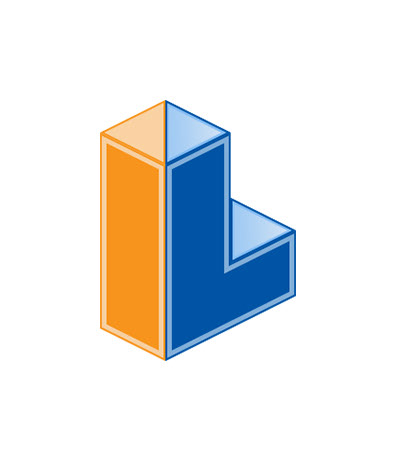
Back in 2016, I redesigned the logo, and overall branding, for my employer Interplay Learning. Interplay Learning, simply put, makes amazing learning simulations. We wanted to embrace the simplicity but depth of our product. Below is the final logo... but after that image is the process/path it took to get from sketch ideas to this final product...

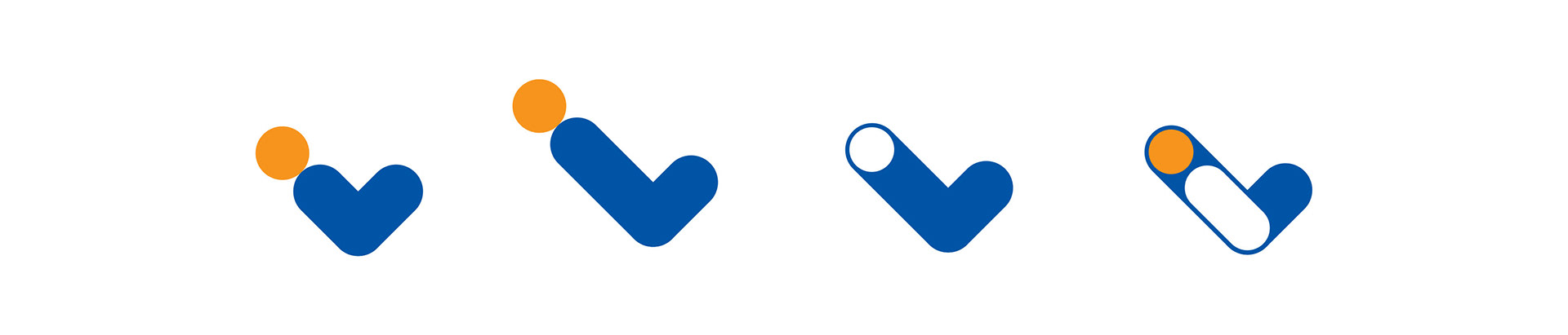
The following 4 rows of 'iconcepts' (see what i did there) were the product of several days of just brain sketching in my Moleskine. The first two were very soft, round and almost emulating a human being.. too far?

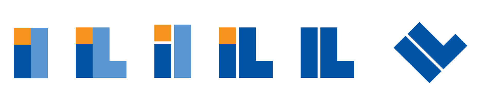
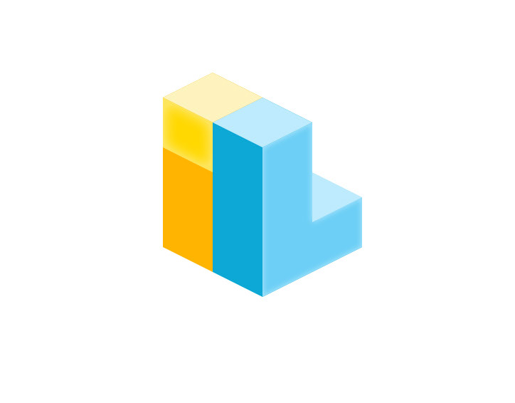
This one was the start of what the final logo would turn out to be, but I didn't know it yet. I wasn't really sure where the stakeholders would fall...
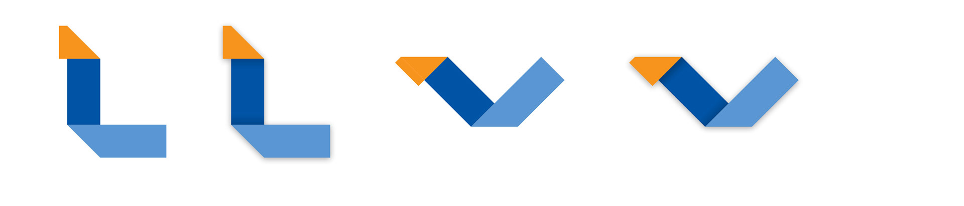
...and this little group was me really streeeeeeeetching my brain. I was attempting to deconstruct the logo a bit BUT embrace the simple beauty of complex origami.
So we all thought the 3 row (out of the 4 above) was the right way to go BUT we wanted to push it further.. why should we have a 2D logo when we are a 3D company....
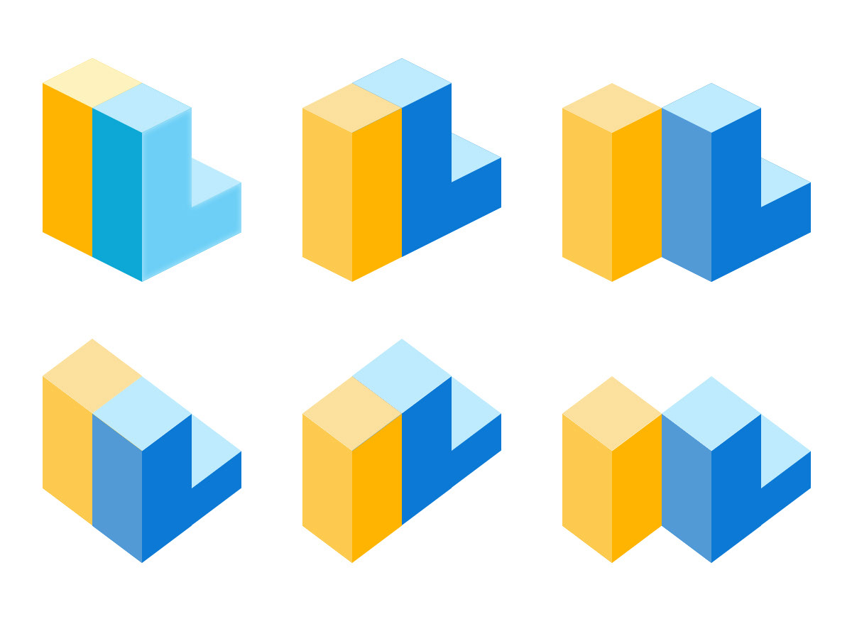
The last batch of icon ideas were going in the right direction but I needed to embrace the stronger colors in our palette... I also spend plenty of time just messing with the arrangement of the elements of the logo (which was super fun). This was all made in Photoshop using shapes. I would eventually go on to make a legit 3D object in 3DS Max, but I will forever think the 2D version of the 3D logo is where it was at!
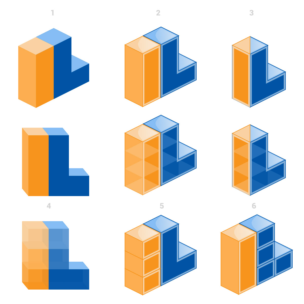
This next set of logos ideas was me embracing my inner M.C. Escher... but the middle one in the bottom row was proving to be the right direction...
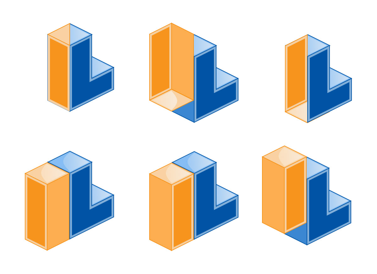
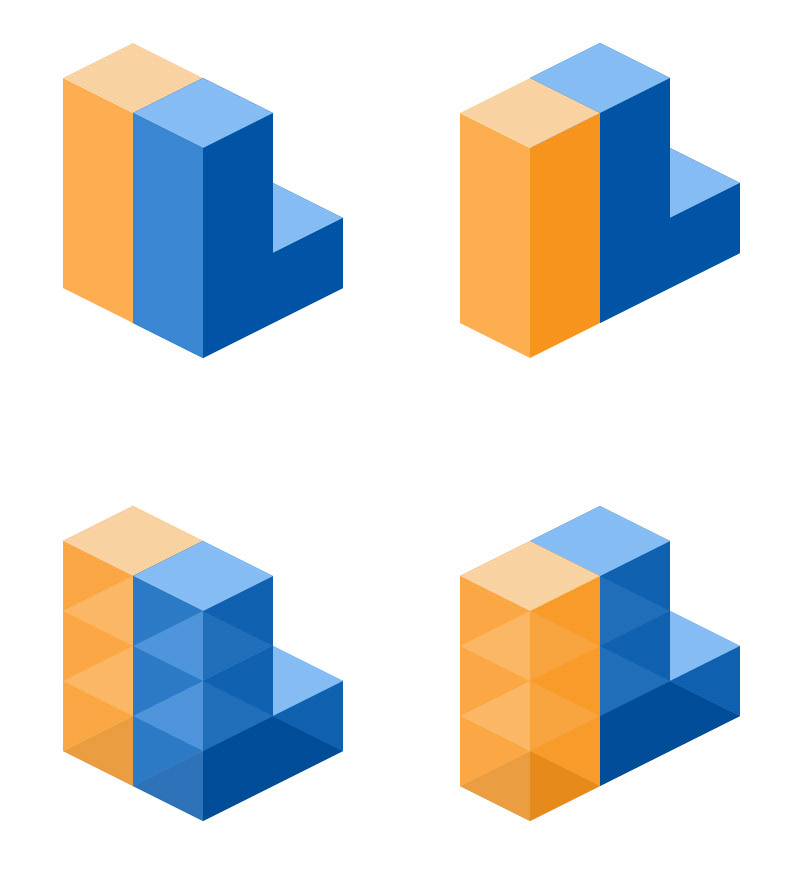
And this was the last round of concepts.. I feel that each had it's own level of cool and interest but ultimately #3 won out... but what a fun process this was!!! I did all that work for an orthographic 3D 'L'.... lol