Background
Often times a development team must submit their latest build to be reviewed by team leads and stakeholders.
The feedback that is sent back to the team must be ingested and output into actionable items very quickly.

Problem
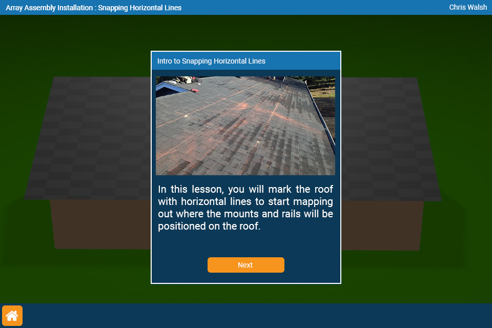
User is thrust into a simulation without any pause or any lead-in information.
Solution
Incorporate an 'Intro Popup' that contains proper imagery and copy.

Problem (left)
•Step instructions are not clearly visible.
•Nothing is properly labeled.
•Lacks user guidance
Solution (right)
•Redesigned the top bar interface to make the step instructions easier to read.
•Suggested the addition of labels on important elements in the environment
•Create very clear guidance elements and placement of said elements (arrows).

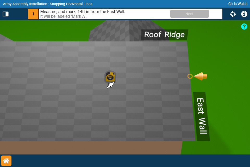

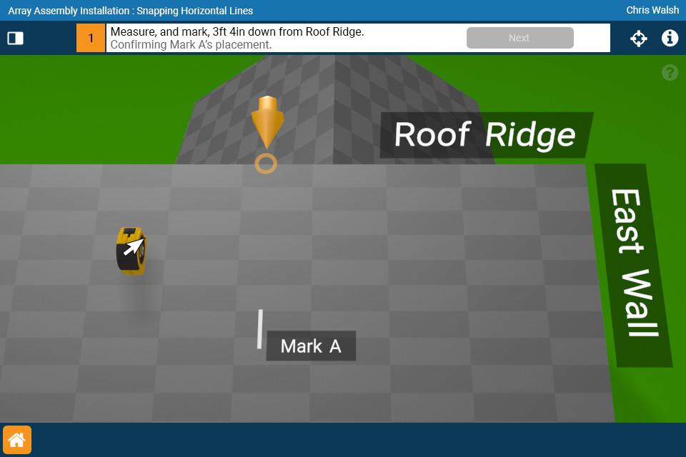
Problem (left)
•Measurements are not clear/discernable from the background elements
•Tools aren't always present during the user's interactions.
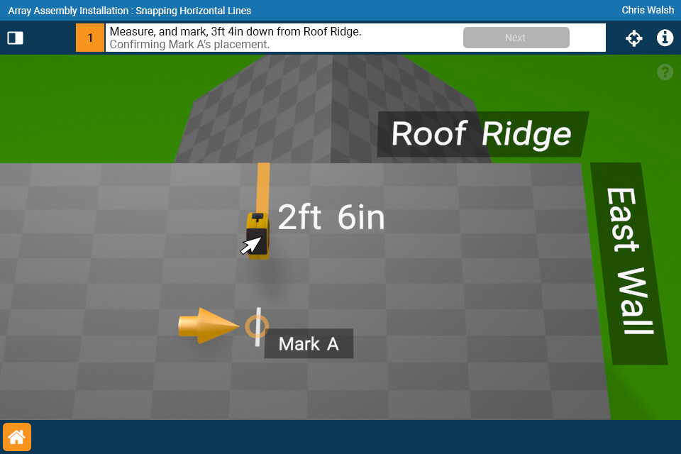
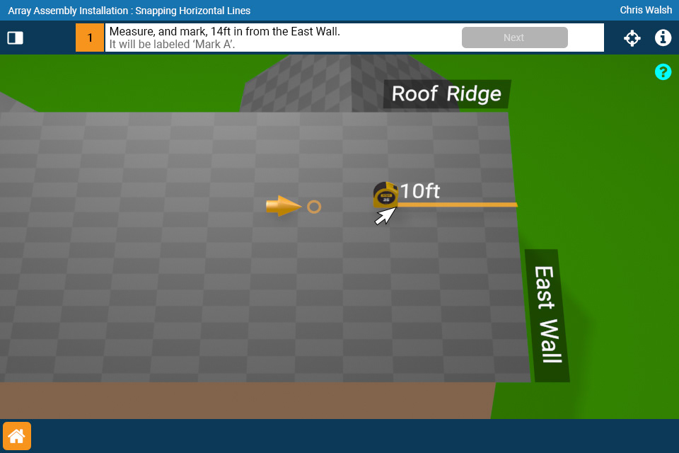
Solution (right)
•Increase thickness of measurement line, increase thickness of measurement text.
•Added in the tape measure tool in 3D space to help convey the measurement action.

Problem (left)
•User-made 'marks' are not clear and easily visible.
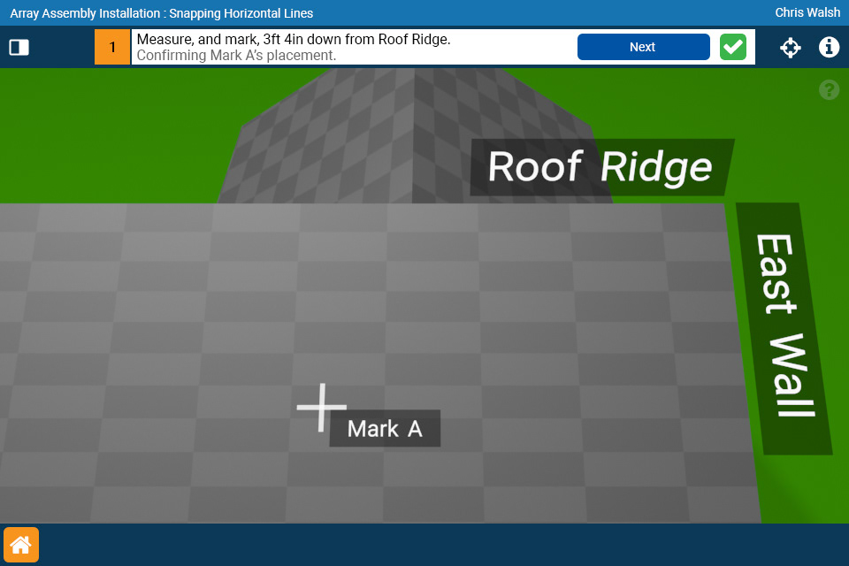
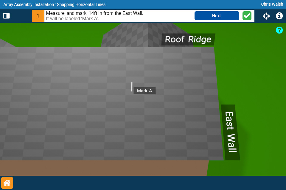
Solution (right)
•Increase thickness of 'mark' to have it stand apart from the background.
•Add a label to the 'mark' to assist with instruction text and user clarity.


The items listed above are just a sampling of suggestions that were made based off of the feedback.
Not all of these suggestions made it into future builds, but that is not always the intent of exploratory documents.
It did lead to conversation about the product overall and actionable items.
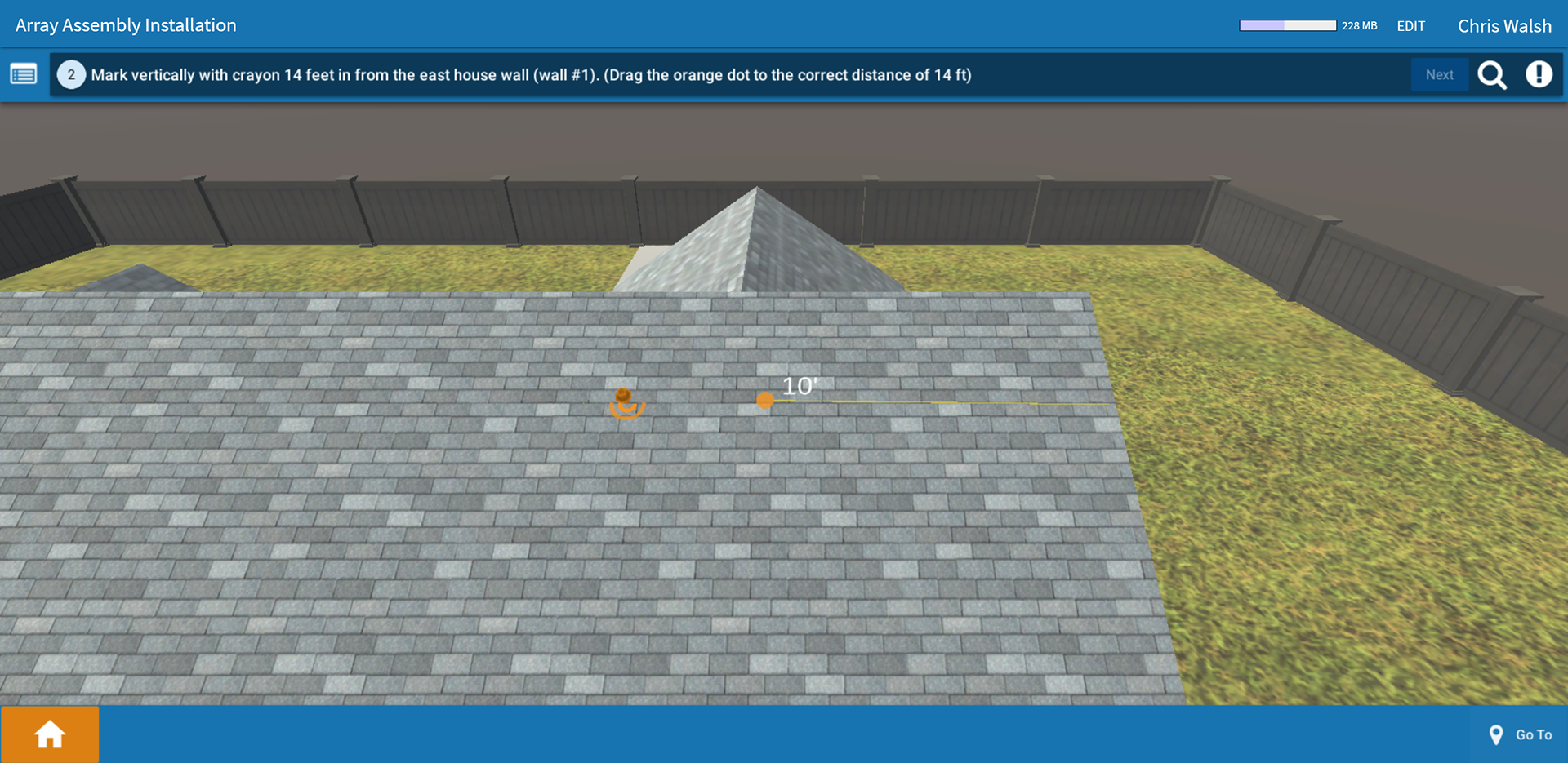
Here are a few more images that were a part of the document. These images are a culmination of the above listed suggestions.